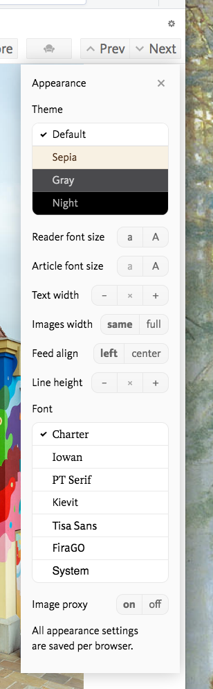
Themes, typography and image proxy
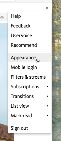
Hi, today I’m glad to announce a number of new features in BazQux Reader. Go to settings ⇒ Appearance (or press Shift+T) to see and configure them:
 ⇒
⇒ 
All appearance settings are applied immediately. No need to reload the page. Settings are saved per browser so you could have different appearance on desktop, laptop and mobile.
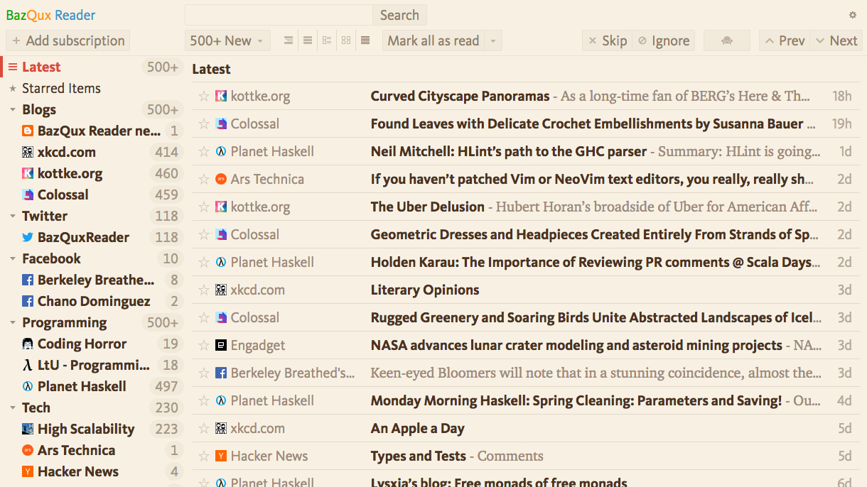
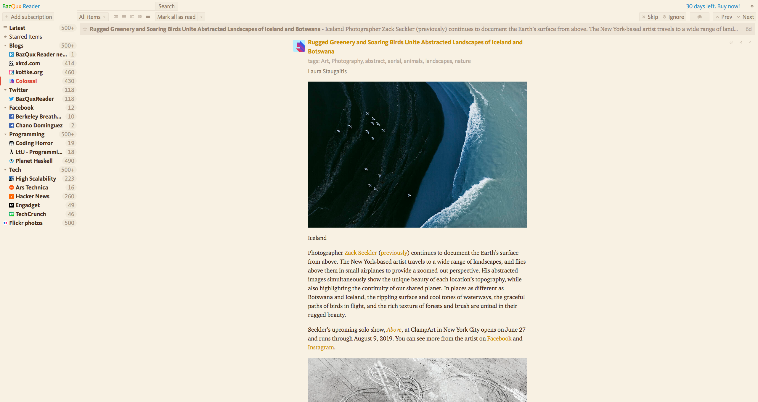
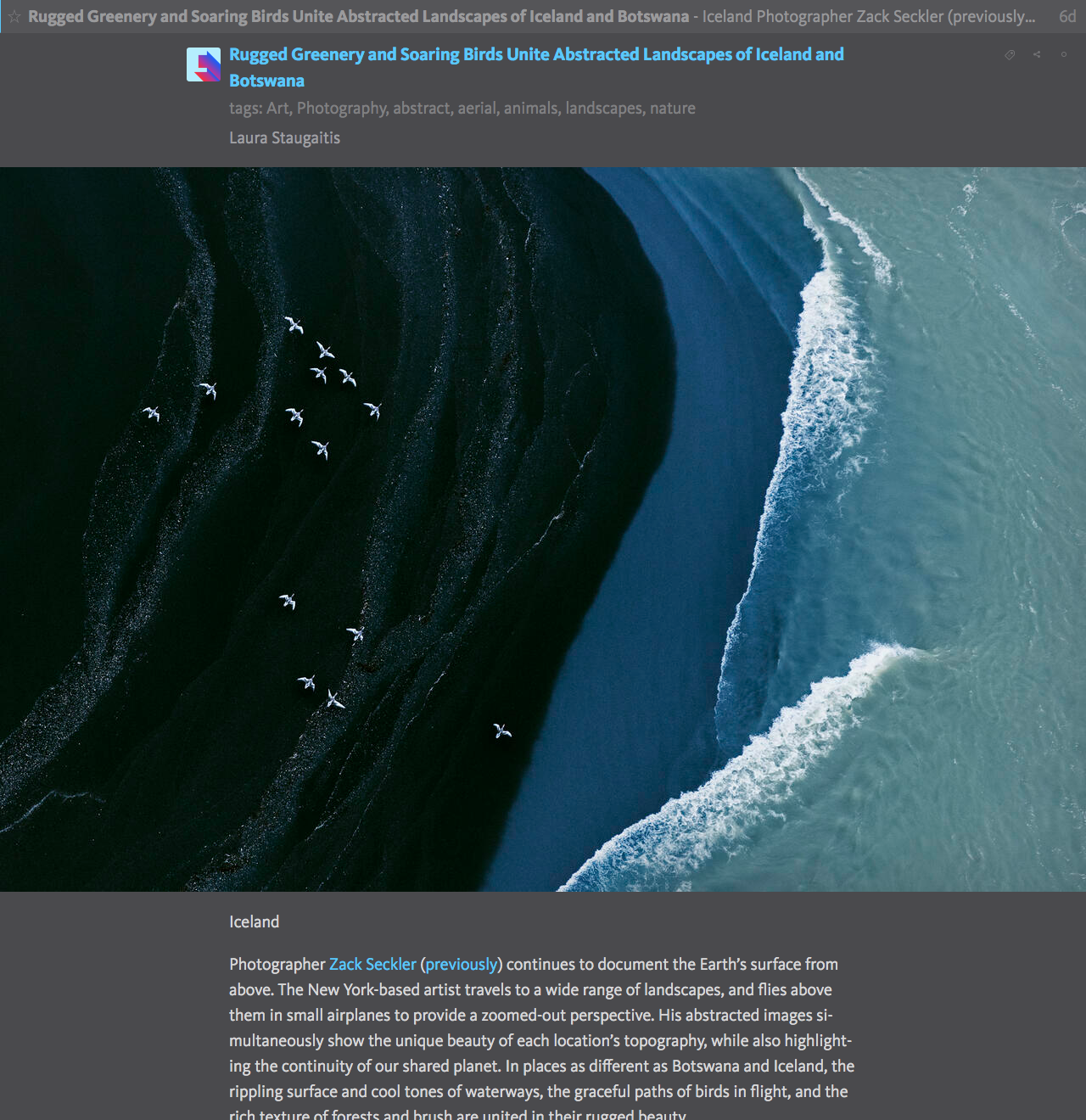
Themes
As you see there is a night theme. During the last year many people have asked about it and here it is:
And gray theme (which could be better at twilight):
And sepia one (great for long reads):
Fonts
You can choose the reader font. It turned out to be a much harder feature to add than a dark theme.
I’ve spent a lot of time reading articles in various fonts on various devices trying to find fonts that are readable in any setting, comfortable for prolonged reading, supports many languages, neutral yet beautiful and elegant. Resulting set is quite small so you could spend less time choosing font yet diverse—each font is unique and looks unlike any other in set. All fonts (except the system one) are bundled with BazQux Reader so they work the same on all devices and operating systems.
Default reader font was changed to Charter—highly readable font found in many books and on some popular sites like Medium. Default font size was increased too (since there is no point in 13px font on today screens) as well as line height. You could always switch back to the system font and decrease font size and line height in Appearance dialog to make reader look like it was. But I recommend you to read in new font (or choose your own). After some time you might like it more than the old one.
Most other feed readers allow you to change article font only leaving the rest of the interface as is. I decided to not cut corners: when you set font you set it for the whole reader and you get much more consistent view. To make things look even better, different font is used for UI and headers in some cases. Each font has its own vertical alignment and a lot of time was spent to line up all buttons, icons and labels.
Layout
Besides customizing text width and line height there are couple experimental options. You can center your feed (looks better on wide screens):
And you can make images take full available width while leaving text width as is. It may look strange with left aligned feed but it looks interesting with centered feed and it looks amazing in fullscreen mode which now always uses centered feed (press f to toggle fullscreen mode):
Typography
I’ve applied a lot of advice from the wonderful online book Practical typography. I recommend it to anyone writing anything for anybody (documents, letters, résumés, presentations, blog posts—everything wins from the good typography). Most visible things are:
-
Headers and post titles made less huge. In fact they’re only slightly bigger than text. Now, when looking at other sites I wonder: “Why your titles are so big? Have you read any book?”
-
Links are no more underlined. It leads to huge readability improvement (and to similar “Why you’ve underlined it? It’s impossible to read now”).
-
Block quotations have no strange vertical line to the left and no color.
-
Straight quotes ' are automatically replaced with apostrophes ’ where applicable.
There are numerous spacing and alignment tweaks to make reading more smooth.
And finally there is a hyphenation. It shines the most on narrow mobile screens. Compare text without and with hyphenation:
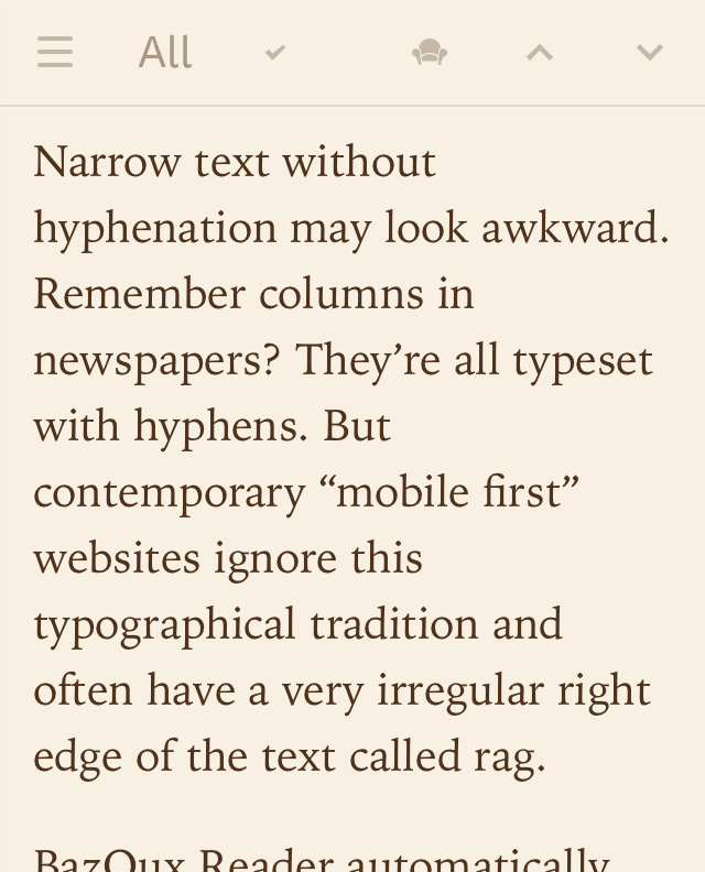
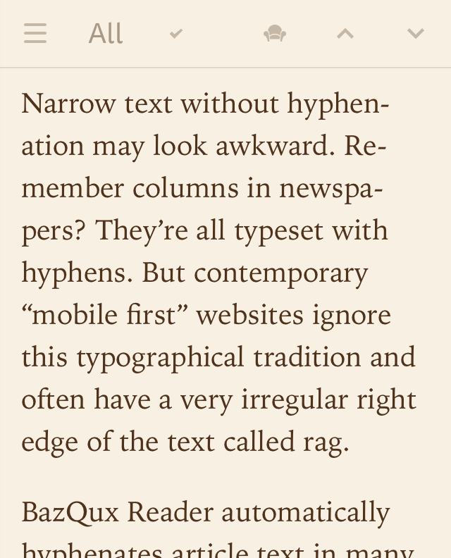
Right edge becomes less ragged and more text fits on the screen which leads to less scrolling.
Hyphenation rules vary per language so I implemented a language autodetection. It works for most major European languages but may not work well with mixed-language texts, short texts and texts in less popular languages (if your language is in this list but articles are not hyphenated, please, send a list of popular feeds in your language to support@bazqux.com so I could train a language detector).
All these tiny bits together improve readability a lot and efficiency of reading is a main focus of BazQux Reader. 99% of time you spend in BazQux you’re reading. And with latest changes you may feel that you’re reading a book not the web app.
Image proxy
The next major feature is an image proxy. All images are now proxied through BazQux Reader servers. HTML5 audio and video are proxied too (YouTube and other embeds are not proxied since it’s impossible to do). Images that are larger than text width (or browser width in full width images mode) are scaled down to save bandwidth and improve loading time and scrolling speed. Impact on image quality is negligible (browser will downscale image anyway). Larger versions of images will be loaded automatically if text or browser width changes.
Speed was the main reason for implementing image proxy since I’ve tired of investigating why reader is slow only to find that some nice small photo is actually 20 megapixel monster ;) But there are numerous other advantages of image proxy:
- No browser’s mixed content warning.
- All images load fine in Firefox strict privacy mode (it blocks images from Twitter/Facebook/VK otherwise).
- Sites that prevent hotlinking (showing images on other sites including feed readers) may start to work.
- Privacy: other sites do not know which images you have viewed.
If, for some reason, images are not loading you could always turn off image proxy in Appearance dialog (no need to reload the page, images from source sites will load automatically).
And some more…
Other things:
- Mosaic view has full non-truncated titles, shows tags and the size of thumbnail scales with the font size.
- Middle click or ctrl+click (or cmd+click in macOS) on header in list view or on image in mosaic/magazine view opens article in background tab and marks it as read.
- Five Filters Full-Text RSS service is used for full text extraction instead of discontinued Mercury parser. I’ve purchased commercial license and self-host it on ftr.bazqux.com to be independent from always closing free services. As a bonus you can use it to convert truncated feeds to full ones (works only with BazQux Reader, other feed readers are blocked).
- Local links (footnotes, article sections) are followed in reader without opening a new tab (use browser’s Back button to go back).
- Image, audio and video enclosures are inserted into articles text in API so you could see them in mobile apps.
- Placeholders are added for all HTML5 audio and video (and for Facebook videos) to delay their loading and increase browsing speed.
- Video details requests (from placeholders) to YouTube/Vimeo are proxied. YouTube won’t track you until you click “play”.
- Internet Explorer and pre 2016-2017 versions of other browsers are no longer supported. Your browser need to support CSS variables (used for themes and layout tuning) to run BazQux Reader.
- I recommend to use Firefox. Changing theme or font size in Chrome/Safari may take several seconds while being immediate in Firefox.
- This blog is now self-hosted (don’t want to depend on Blogger, although I think Google won’t close it).
- There is a new Discourse community instead of discontinued Google+. It’s also used for comments on this blog so I welcome you to try it.
Happy reading!