Mobile web interface
Left panel disappeared in desktop browser? Don't worry, just make window a bit wider.
OK, today I'm rolling out one of the biggest updates in BazQux Reader history—web interface optimised for smartphones. And it's not a kind of stripped down thing—it's complete desktop interface with all the functions but readable on small screen. You get all view modes, comments, settings, search, filters, sharing and saving—everything.
For a long time I didn't want to bother with mobile interface as there are a lot of great mobile apps that support BazQux Reader. But while these apps are great they still do not provide the same experience as BazQux website. Mobile feed reader apps works mostly like e-mail clients—they display one article a time and show a separate list of article titles. You need a lot of tapping and swiping to navigate. BazQux Reader is closer to modern social media feeds—continuous stream of posts where you just need to scroll down. It has a list view but it's only one of many view modes.
I've asked a number my clients about what they miss most in BazQux Reader and most frequent answer was a better mobile experience. So I decided to take a leap and finally improve it.
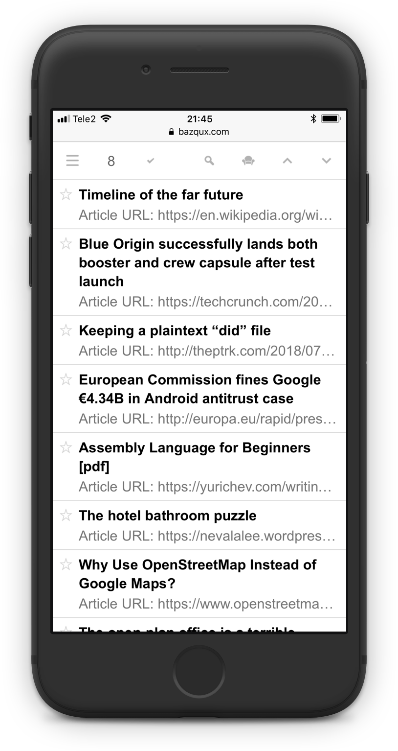
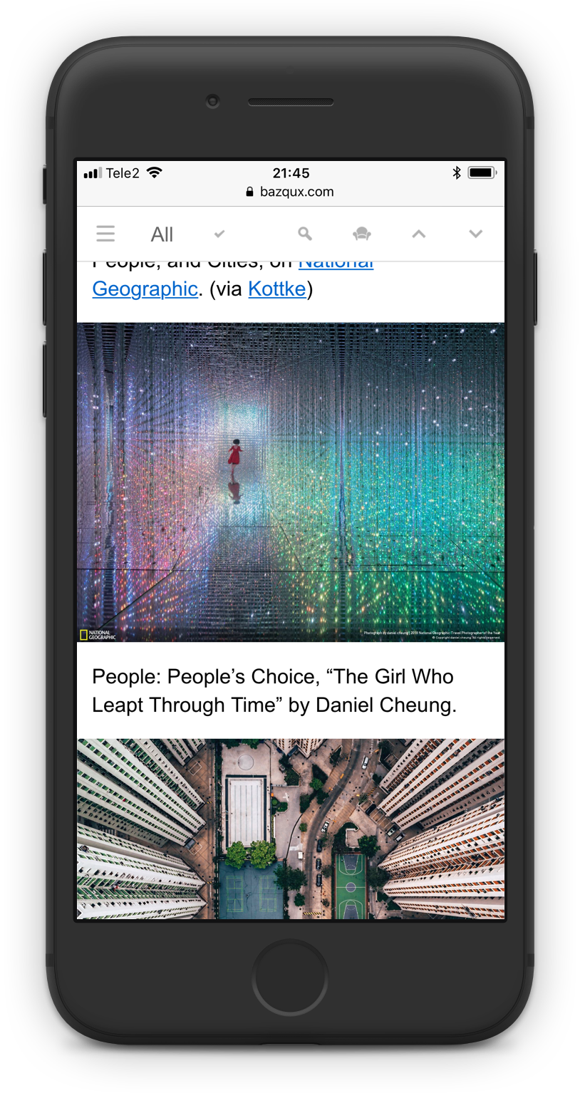
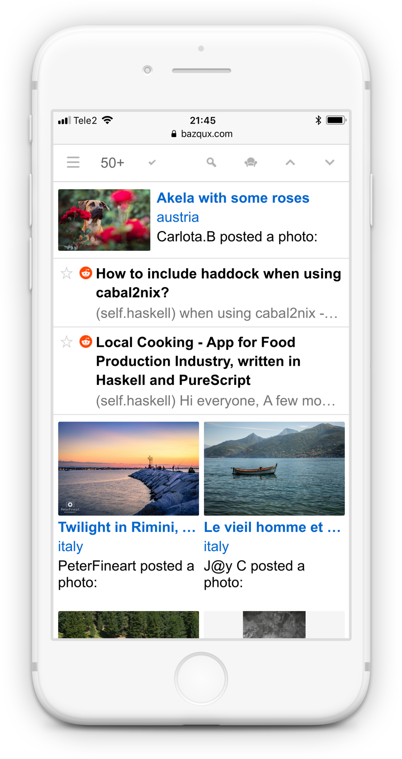
Look at screenshots. As you see list view becomes multiline on narrow screen:
Toolbars, articles in every view mode, menus, dialogs—everything works well on every screen width and any font size.
It took a lot of time to reimplement almost every interface element and to test it on many devices. There are still some things to do but you can already enjoy the same desktop reader experience on your mobile device.
Few more assorted news:
- Password protected feeds are now supported.
- Instagram images and YouTube/Vimeo videos are embedded in tweets if they have links to them.
- More tweets and Facebook posts are fetched at once to not lose anything.
- Full text is retrieved from the first external link in Twitter/Facebook/VK/Google+ and Reddit feeds.
- Blogs with large and infrequent posts are given a priority in search results to promote quality content.
- Added handling of brain damaged GDPR consent in some feeds (some sites think that BazQux servers are EU citizens).
- youtube-nocookie.com used for playing videos to lessen YouTube tracking.
- Disabled showing of related YouTube videos at the end of playback so you don't waste your time.
- Added ability to subscribe to VK topics.
- Added "Font size" item to settings menu to change reader font size.
18 comments:
(July 23, 2018)
Офигенное обновление. Спасибо.
(July 23, 2018)
I love it.
(July 23, 2018)
Очень порадовали. Это намного лучше мобильных приложений для Андроида, которые вы рекомендовали, недавно попробовал их все.
Две проблемы
1. На телефоне не появляются все контролы, например, не видна "шетеренка - не хватает ширины даже в гор.ориентации.
2. На 10" планшете видно все. Класс! Но не понятно как настраивать размеры шрифтов. Вы предлагаете нажимать -+_= но у меня нет внешней клавы. Можете реагировать на клики в окне Справки?
(July 23, 2018)
yaaaaay :)
(July 24, 2018)
Love it. How much work would it take to implement a dark theme? This is the only missing feature.
(July 24, 2018)
Great!
(July 24, 2018)
Спасибо, возможно, получится избавиться от сторонней читалки RSS-каналов для Android. Пока не успел протестировать, возникает ли распространенная проблема с нажатием "Назад" в браузере для возврата к бесстраничному списку тем.
(July 25, 2018)
Themes is a next planned feature. Need to polish few things before, hope to release it this autumn.
(July 25, 2018)
1. Шестеренка переместилась в левую панель -- рядом с Add subscription
2. Добавил пункт Font size в меню настроек
-------
1. Settings menu was moved to the left panel--next to "Add subscription" button.
2. Just added "Font size" menu item in settings menu to change reader font size without using keyboard.
(July 25, 2018)
I haven't looked at it yet, but I'm curious: Did you test the mobile interface in Firefox for Android as well?
(July 25, 2018)
Haven't tested it recently. But it worked more or less OK last time I checked (although there were issue with address bar appearing when scrolling left panel).
(July 25, 2018)
There are stylish/stylus CSS themes for this matter, I'm using one and it's quite good. For Desktop only though.
(August 8, 2018)
On Android I wholeheartedly recommend creating a shortcut to the reader on the homescreen, so it opens in glorious fullscreen mode.
(August 12, 2018)
Would be really great if I could swipe right to left on an article to mark as read. If possible please implement, Or a small button on the right of each article. I usually skim through a couple hundred on my computer each day, would love to be able to do the same on mobile without having to click on each.
(August 31, 2018)
a very smooth experience! Bazqux remains my top favourite reader!
(September 4, 2018)
Loving the interface - thanks a lot! Works great on iPad and iPhone!
(September 23, 2018)
Good News


Fewcher (July 23, 2018)
Спасибо за фиды с вк, тут некоторые люди зарабатывают на этом)